Introduction
Lynd Ward’s Vertigo: A Novel in Woodcuts, published in 1937, tells the story of a girl (The Girl) who grows up dreaming of becoming a concert violinist, a boy (The Boy) who dreams of becoming a builder, and a conscientious but morally weak industrialist with a morbid fear of aging (An Elderly Gentleman), and how their lives are affected by the Great Depression . On one level, Vertigo is a proletarian novel that valorizes the worker and inveighs against the evils of capitalism; on another, a gothic tale about the existential dangers of Modernism. Yet, notwithstanding its prescriptive intentions, Vertigo also manages to be a profoundly moving, idiosyncratic story told through wood-engravings of technical virtuosity.
By far the most ambitious novel of Ward’s oeuvre, Vertigo rejects the linear narrative style of traditional story-telling, instead using three overlapping sections that braid together three allegorical and yet individuated stories. While telling their own stories, the second and third sections function as magnifying lenses that resolve hidden details, clarify ambiguities, and deepen and problematize elements of the preceding story(ies). They force the reader to continually look back and refresh their understanding of the earlier graphic passages and, in that sense, Vertigo has a surprisingly contemporary, postmodern feeling. One might say that in its instability as well as its presentation of multiple sides of the story simultaneously, the narrative schematic reproduces the Cubistic style of many of its wood-engravings. The climatic 230th image of Vertigo actually precedes the chronological ending of the story, which occurs some one hundred and ten images earlier, so that the reader is compelled to reinterpret the final two chapters of the second section and adjudicate between two equivocal "endings." This indeterminate ending is the most conspicuous example of Vertigo’s volatility. Ward also uses symbols (a rose, timepieces, a jagged line, a star, a whiskey bottle, etc.), and whole compositions, subtly altered (homologous pairs) recursively, to simulate the suggestive power of words, and liberate the story from the centrifugal pull of linearity.
One might easily say that, in its linking together of divergent graphic "passages" by repeating images and structures, Ward has created a prototype of the hypertextual novel, and that the mutually reflexive, reciprocal dynamic models the kind of polyvalent sympathy and decentered self valorized by his story. By employing a Modernist technique that subverts the traditional notion of an objective and independent reality for his ideological discourse, Ward seems to be gesturing toward an artistic idealization of The New Deal, whose pragmatic interventions he clearly viewed as a valorization of humanistic ideals over the holy grail of laissez-faire capitalism. Ward seems to have constructed Vertigo in the belief that by modeling an alternative discourse grounded in affirming subjective experience (or phenomenological truth), he would artistically refute Roosevelt’s critics and the powerful enemies of the liberal social policies of The New Deal. Politicizing the emergent modernist novel within a purely graphic medium places Ward squarely at the root of a tradition that we see flowering today in the novels of Daniel Clowes, Eric Drooker, Adrian Tomine, and Kim Deitch, among others.
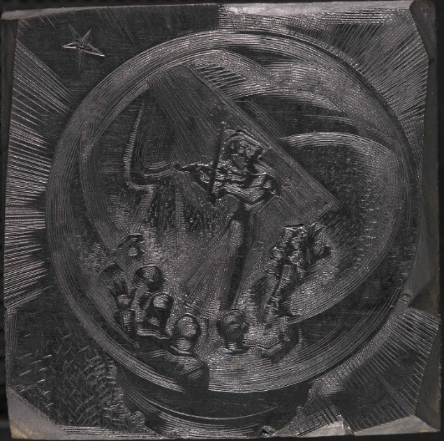
Ward's decision to cut blocks of specific sizes was similarly innovative, though it grew logically out of earlier experiments. Unlike his five previous graphic novels, Vertigo is constituted by wood-engravings cut programmatically into four sizes 2" x 2"; 3 ½" x 2"; 3 ½" x 5"; 5" x 5"1 each with its own rhetorical and expressive strength. (For these brief essays, we are going to refer to the four sizes as follows: small, medium, large, jumbo.) Unlike Frans Masereel, whose woodcut novels he was emulating, Ward had varied the sizes of his woodblocks, beginning with Gods’ Man. Vertigo, however, was the first (and last) graphic novel to calculate that differently sized blocks could systematically elicit a range of specific emotional and narrative effects. This exhibition will discuss Vertigo’s small images and show graphic reproductions of approximately half the number of woodblocks (18 of 40) used in their production.
The small, square images make up the smallest category of the four differently sized images that tell the story of Vertigo. While the large and jumbo images have the capacity to be more artistically impressive, to show more detail and entertain the eye longer, the relative scarcity of the small images makes them more exotic. The smaller frame requires a greater miniaturization and hence forces readers to look more closely, which draws them deeper into the image and also arrests the flow of the text. The fewer details that compose the small image tend to receive greater attention and make a greater subliminal impression. They are like small architectural niches for rare icons, or ephemeral moments that nonetheless have great personal significance.
Therefore, these small images tend to mark or emphasize moments of intense stress or emotion; to heighten drama and, through contrast with the larger images that precede them, to emphasize a crucial plot twist or character trait. While the medium size images narrate events with a more neutral, dispassionate tone, the small images often focalize the text from a character’s perspective, revealing a psychological reality that underwrites the narrative. Whether Ward was influenced by contemporary movie technique or not, it is hard not to think of Vertigo in terms of shifting camera angles, establishing shots, panning sequences, quick-cutting, and so forth. Therefore, it is sometimes easy to think of his small images as close-ups—either glorying in an unsurpassable moment of joy, or accusingly confronting an act of unconscionable villainy. At times, by paring away context, these "close up" force us to suffer the character's clawing anxiety or heart-pounding suspense, with no extraneous detail to divert and console us. Pressed by the wide, bland margins surrounding them, the smaller image also sometimes conveys a diminution of vitality, a guttering out of differentiation, of life.
When two or three small images appear in succession 2 in "The Girl" section, they seem to materialize an ideal, and annul the flow of ordinary time: they represent moments of bliss, of ethereal transport. Oppositely, in the "An Elderly Gentleman" section, they suggest the Gentleman has reached a new moral nadir or ebb of vitality. The contraction of visual space in these images creates a very creepy, disconcerting sensation of shrinking from the light. The only passage in Vertigo in which more than three small images occur in sequence falls in the "Elderly Gentleman" section. Here, visually chopping up the moment into five piece (again, like "quick cutting" in a film), invokes the nauseating (vertiginous) effect of a barrage of unintelligible or disturbing perceptions. 3
The sequences of two successive small images and three successive small images that occur in "The Boy" section imply moments of extraordinary drama, moments during which (again) time seems to stand still. To a certain extent, both formally and thematically, the problems with which Ward is wrestling in Vertigo seem to converge upon the problem of escaping time.
We have presented the eighteen excerpted images in a sequence that follows the flow of Vertigo, and the discussions accompanying each image attempt to represent the narrative context, as well as refer to earlier or later images that influence our interpretation. While an argument could be easily brought that any anteceding part of a novel conditions an interpretation of any later text, in the interest of clarity we’ve made cross-references only between images that we think have a significant narrative or structurally homologous bond, and mean these merely in a demonstrative and heuristic and not prescriptive sense.
The exhibition text has been broken up into three sections corresponding to the three sections of the book, "The Girl," "An Elderly Gentleman," and "The Boy," for ease of reference. Also for ease of reference, we have given an interpretive title to each image (i.e., IMAGE 30: Glorious Future): these titles do not appear in the book, of course, since the book is wordless. While it can be argued that these titles misinterpret or, worse, misrepresent Ward’s intentions, our defense is that all of this exhibition is open to—and invites—the same kind of criticism. Ward did not write about his intentions, except in the most general way, believing that the meaning of his books should be decided by his readers, and, therefore, one cannot presume that his or her exegesis is free at any point from the invasive strengths and weaknesses of a subjective reading position. We hope that our reading position will resonate and find favor with other readers, that our non-critical and pre-critical biasses are of some moment in the universe and will elicit provocative critical responses.
Less controversially, we also have identified the images by their position within the text, beginning with image one and continuing in sequence until the final image, image 230, since the book as published by Random House is unpaginated. Claims certainly could be made for other systems: that the enumeration should begin anew in every section of the novel, so that our image 67 would be "Elderly Gentleman" image 1, or, that where possible chapter titles should be used, so that our image 145 would be "the second image in October" (or "October the 2nd"?). Without denying the appeal of alternative perspectives, our numbered images correspond to the numbers inked onto the woodblocks in the Rutgers University Libraries collections, if not by Ward than someone close to him. Referring to the image by the number inscribed on the woodblock—so that image 186 may refer to the image created by block 186—had the appeal of a certain inarguable logic. Thus, our incepting image is image 1, and the concluding image, image 230, which, for the sake of the ear, we have abbreviated to I1, I230, etc. (To help the eye distinguish these units from words, and scan them in the document more quickly, we’ve marked them to display outlined, e.g. I30.)
Notes
1. There are 40 small images; 91 medium sized images; 51 large images and 48 jumbo images.
2. Small images occur in sequences of two or more images 8 times: 1 sequence of five images; 2 sequences of three images; 5 sequences of two images.
3. The uniqueness of this sequence of five small images is important in understanding Ward's sympathies. The images are of the faces of the five board members of the Eagle Corporation as they warn the Elderly Gentleman that his business faces perilous consequences unless he takes a particularly egregious course of action. The five small images formally impart the sense that the Elderly Gentleman reels under their combined onslaught, even finds their manners detestable. Thus his subsequent acts of iniquity are to be understood as his spiritual defeat, and deserving of some of the reader's pity.