Second Annual New Jersey Book Arts Symposium
Book Arts and Education, or, Preaching What We Practice
Book Artist: Philip Grushkin

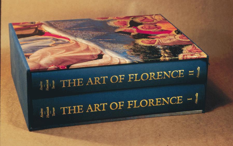
The Art of Florence, by Andres, Hunisak and Turner. Two volumes, boxed. Trim size 11" x 13", 1312 pages, 700 color plates, 854 duotones.
This was a monumental book in its conception, design and production. The color plates are strewn throughout the book in thematic groups. Many of the color images appear as foldouts so as to gain larger scale. The texts appear in sections that are dovetailed with the color. To aid the reader, the color images are duplicated as small duotones in the outside margin of the text pages, together with small references in the inner margin to pinpoint where the image is discussed. This was a chess game to get all the components to work.

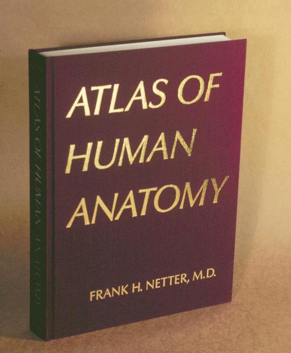
Atlas of Human Anatomy, by Frank H. Netter, M.D. Trim size 9 1/4" x 12 1/4", 592 pages, 515 color plates.
These gross anatomy color plates were culled from a collection of paintings done over a fifty year span by an important medical illustrator. The plates were newly photographed in a new scanned lightin technique, the ektcromes hand color corrected, new separations made to a consistent format. New labels were prepared (more than 2 miles of leader line drafting tape was used). The various bleed part title pages (detailed contents pages) were planned as a device to help find one's way through the book, you fanned the book edges and the gray background noted a part title section. An enormous amount of checking and correcting had to be dealt with, made easier by segmenting image, label and leader line on separate overlays. This was a very exciting book project as I participated in every part of the activity from the book's conception to its conclusion on press in Japan.

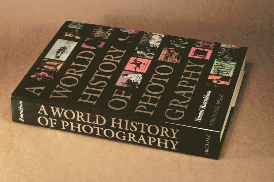
A World History of Photographs, by Naomi Rosenblum. Trim size 8 3/4" x 11 1/2", 672 pages, 803 plates in duotone and full color.
A very tight 2-column format packing in a tremendous amount of pictorial material as well as text. The gray second color was used here and there to relieve the density of the typographic page as headings, running feet, chapter openers. Portfolio sections of thematic groups also help change the pace. The images in these portfolios were frequently bled to the edge of the page, increasing the drama and importance of the images. All the other images were constricted to the tight page format. All picture references in the text appear as close as possible to the image. The use of duotones, which is basically a two-color separation in black and grey were very successful in producing images of great tonal value. The jacket is unusual in that the front is duplicated on the back with the title repositioned.